This package redesign had 3 main criteria
Visual Uniqueness
The package should stand out better than its competition at point-of-purchase
Desirability
The package must improve desirability and recognition over the existing package design
Sustainability
The package must be designed with environmental impact in mind
I. RESEARCH
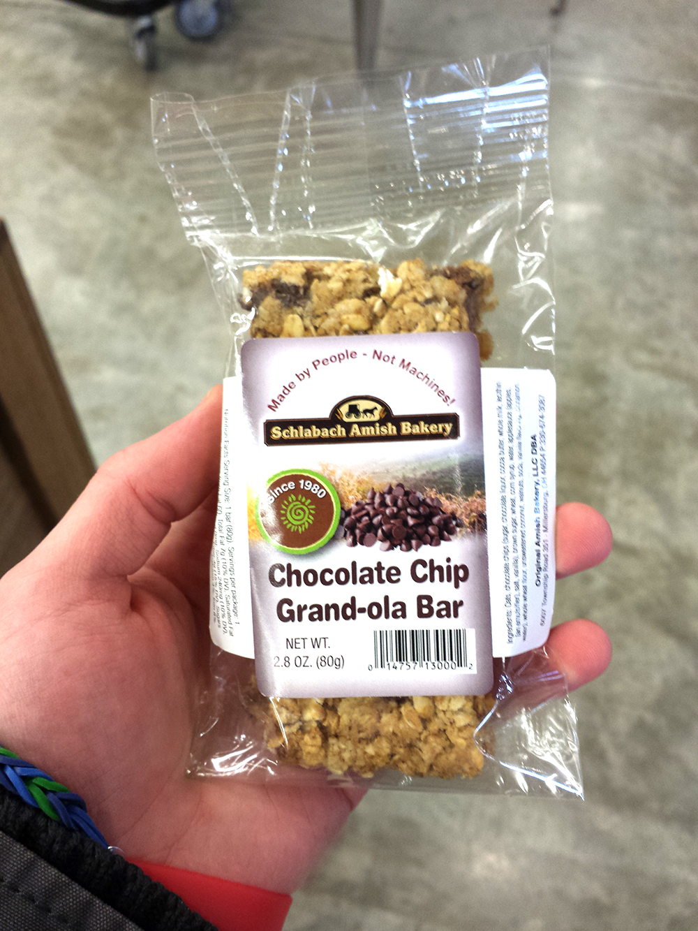
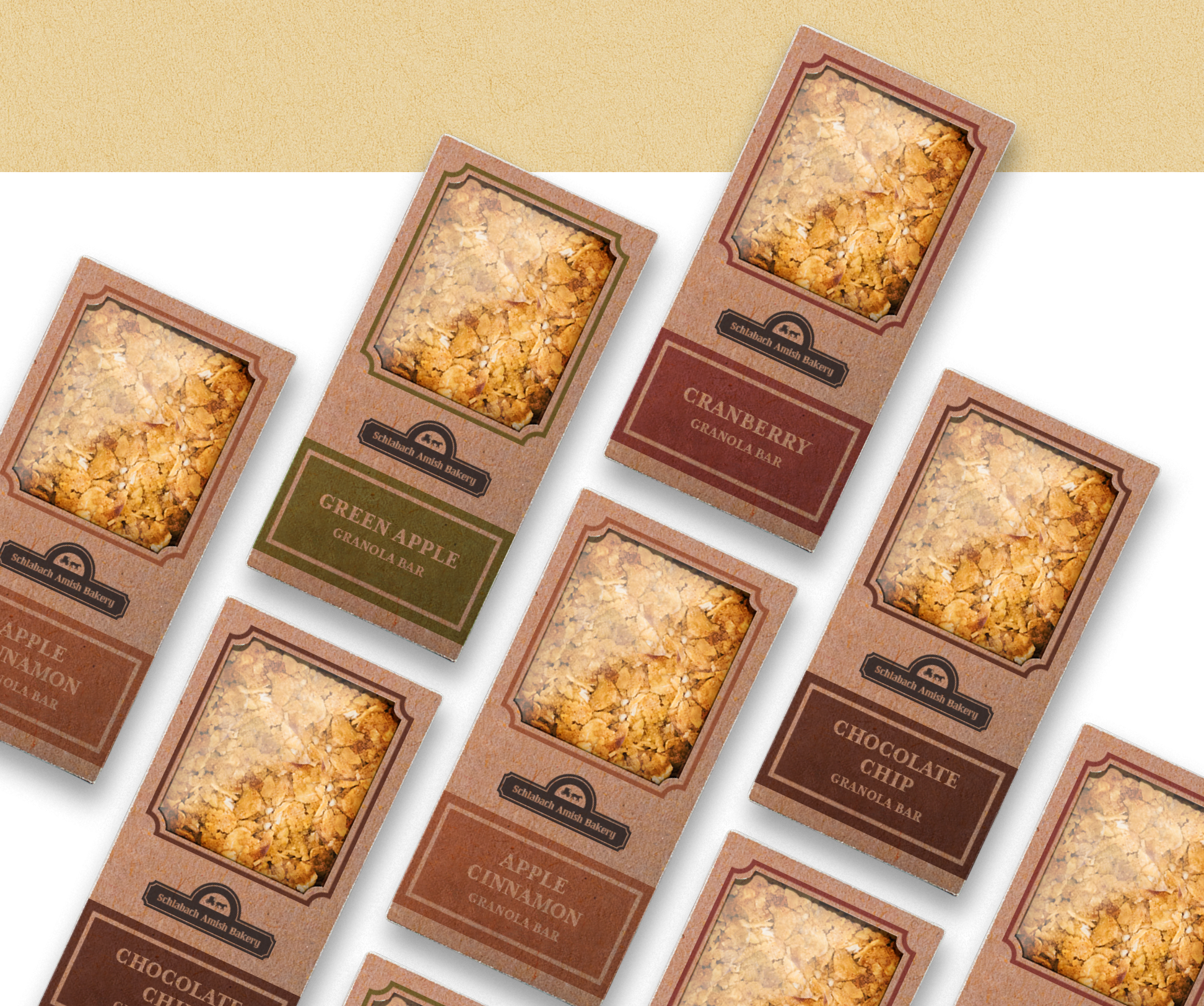
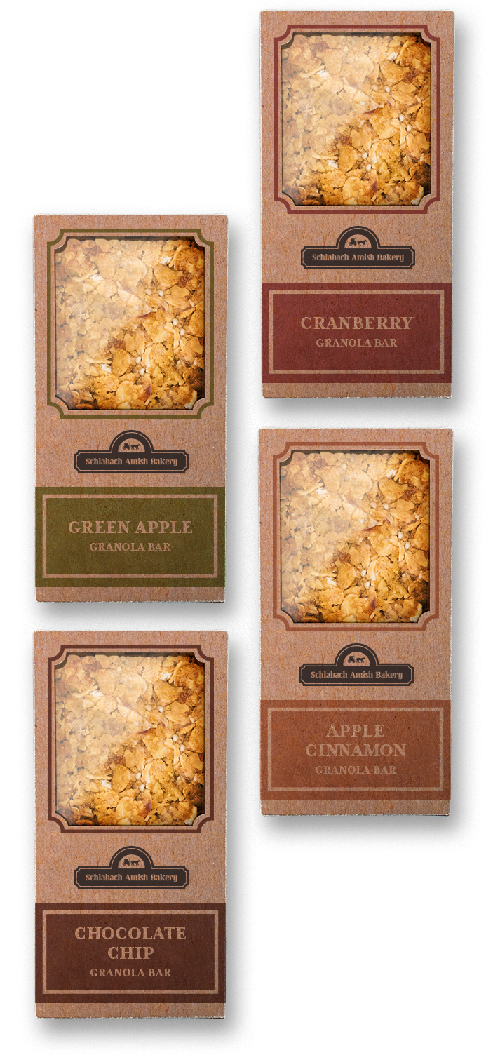
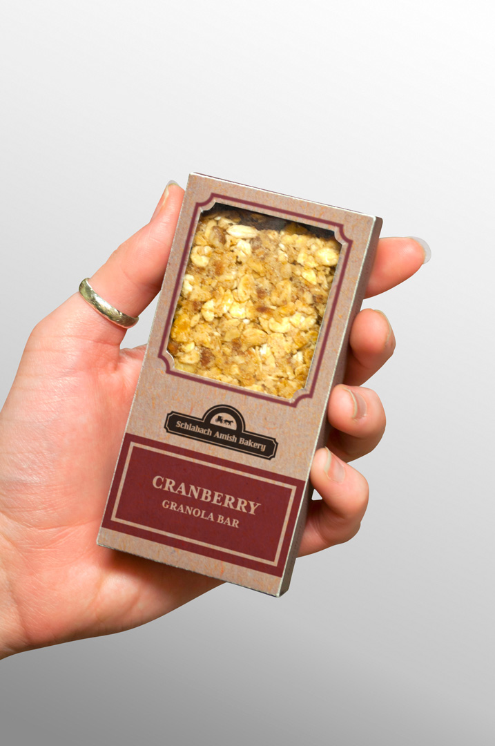
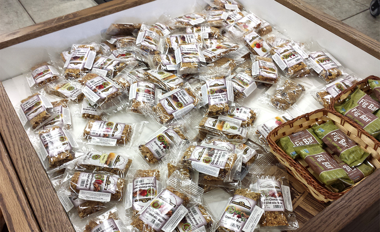
The presentation of the product didn’t stack up to the neatly boxed and organized competitors, like KIND and LÄRABAR.
The presentation of the product didn’t stack up to the neatly boxed and organized competitors, like KIND and LÄRABAR.
While the bars are processed manually, the original plastic packaging feels anything but hand-made.
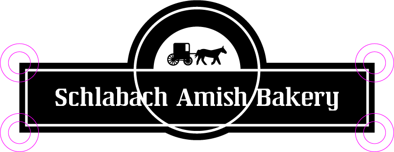
II. LOGO REFINEMENT
The logo needed minor revising to increase legibility at reduced sizes by thickening outlines, removing the wheat on either side of the horse and buggy, and increasing contrast in colors. The logo also needed to work in a single color to reduce ink costs.

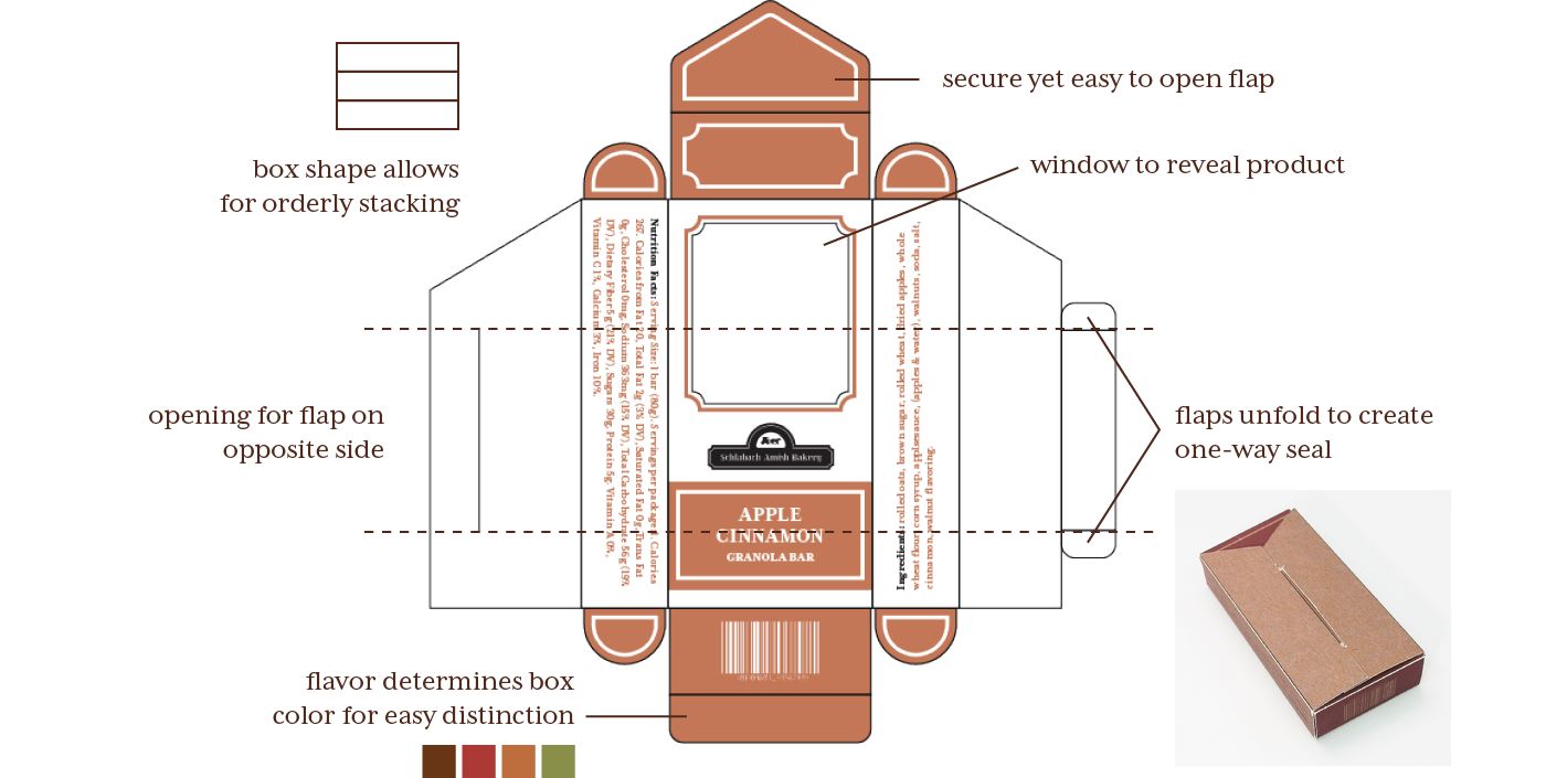
III. DIELINE
The dieline was designed as one piece of material that could be assembled without using glue or tape to maximize sustainability. This was achieved through flaps that interlock and create tension.
Because the granola bars are hand-pressed and therefore inconsistent in size, the biggest challenge was finding the most effective package to prevent rattling or breakage during transportation and handling.