EclipseCorp’s rebrand was brought about by the merging of it’s subsidiaries under one unified brand. There was also a desire to update the look and feel of the office, the brand, and the imagery to modern standards.
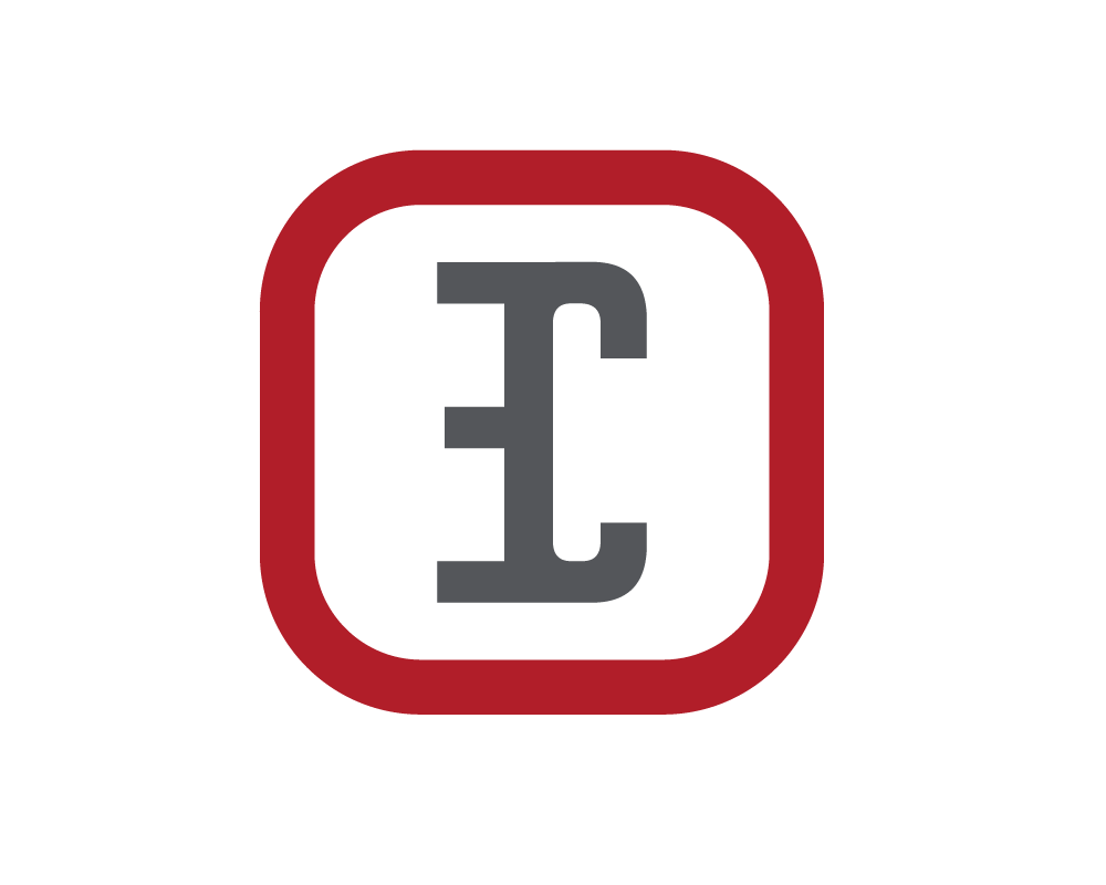
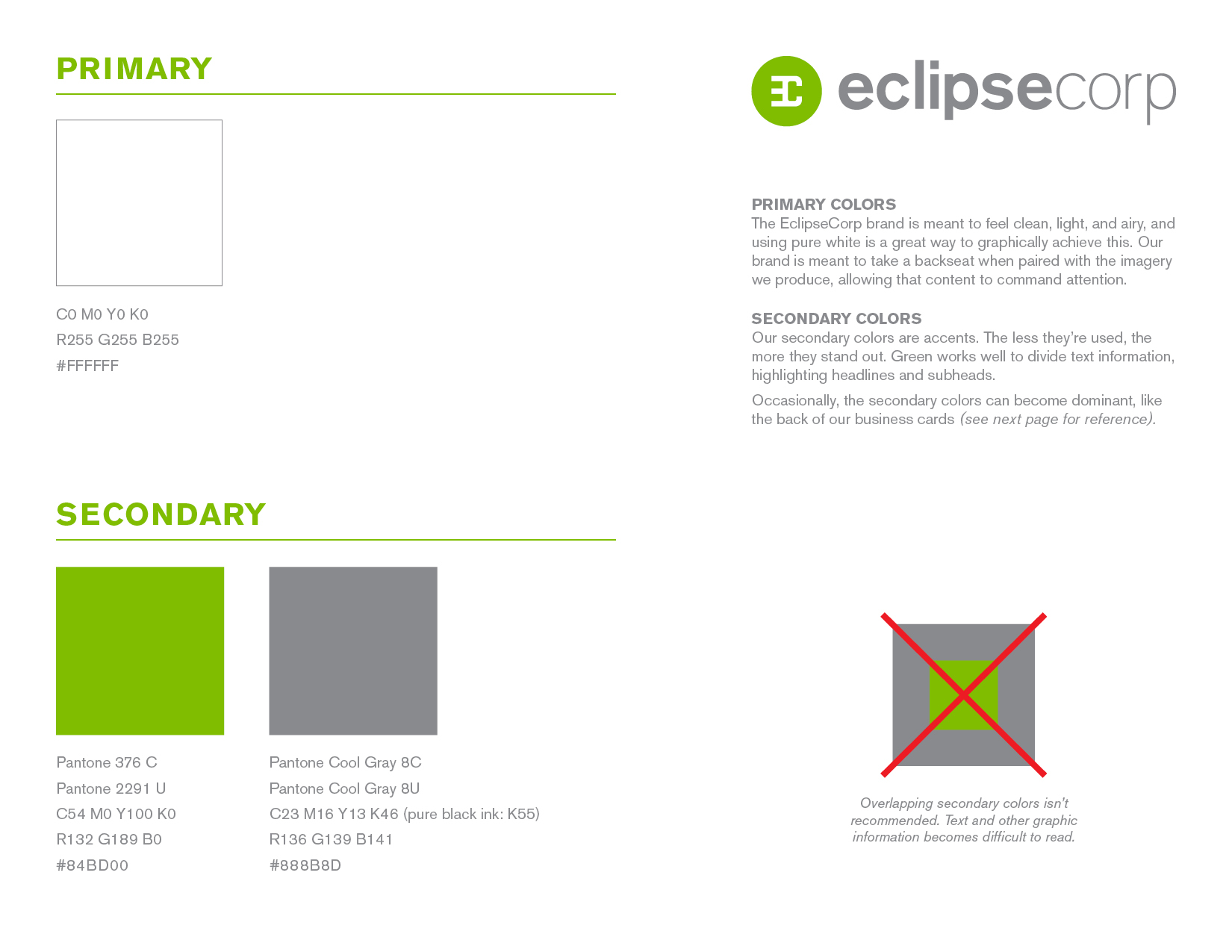
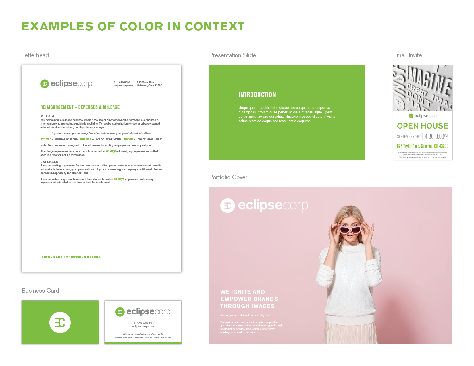
Incremental adjustments were explored before embarking on the full rebrand, such as making the logo more space efficient by aligning the logomark and wordmark horizontally and adjusting the thickness of the letterforms in “CORP.” The desire to move away from red and allow the imagery to command attention led us to remove any color entirely and lighten the gray.
We explored many iterations as a team and revised the logo almost a dozen times to get it just right, testing color schemes, typefaces, and accent symbols. Some of the designs above are reimagined revivals of previous logos. Ultimately, we decided to maintain the recognizable EC monogram, but house it inside a circle to better pair with the roundness of the wordmark and generally reference the “eclipse” element of the name.


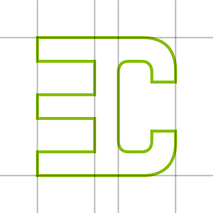

Condensing the monogram vertically into a square shape allows it to fit inside a circle and maintain legibility.
Brand Guide
(Click to see full pages)
Logo design was a collaboration between graphic designers Colin Wendt, Tyler Dunbar, & Jamie Linscott | © EclipseCorp
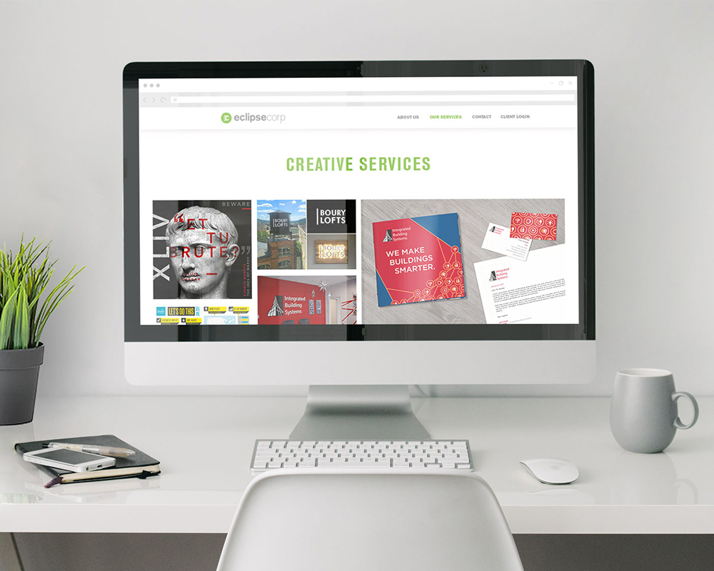
see the website design
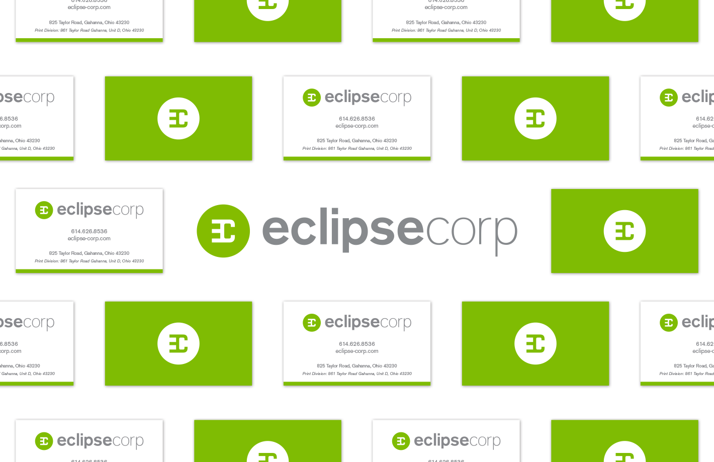
see the mailer